
Updating an Annual Tradition: Arguing Economics at the Dinner Table
By Josh Bivens, Economic Policy Institute
Last Thanksgiving I wrote a blog post in the “how to argue with your relatives at Thanksgiving” genre, providing some hard numbers for people who didn’t want to let their conservative relatives spout nonsense about economics with impunity at the holiday dinner table. This year, lots of those same arguments are still in the news, so I updated some of the data and points for 2015. Also, another silly argument seems to be making the rounds: the claim that the Fed’s low interest rates have somehow hurt “poor savers,” and hence the Fed should raise rates at its next meeting.
So, here’s an updated list of some of the myths that come up every year, and how to address them.
1) The government’s spending too much—they should tighten their belts the same way households had to following the Great Recession
This “tighten the belts” line is perhaps the worst analogy ever. And yes, it’s bipartisan silliness. Simply put, if everybody (households, businesses, and governments) tightens their belts together (i.e., stops spending money) then the result is just a steep recession. Even with increased federal government spending, tightened household and business spending in 2008-2009 led to a savage economic downturn. Actively cutting government spending would’ve made it worse. Much worse. There really is tons of evidence that the increases in government spending during and right after the Great Recession (the Recovery Act, mostly) made the recession much lighter and the recovery come faster.
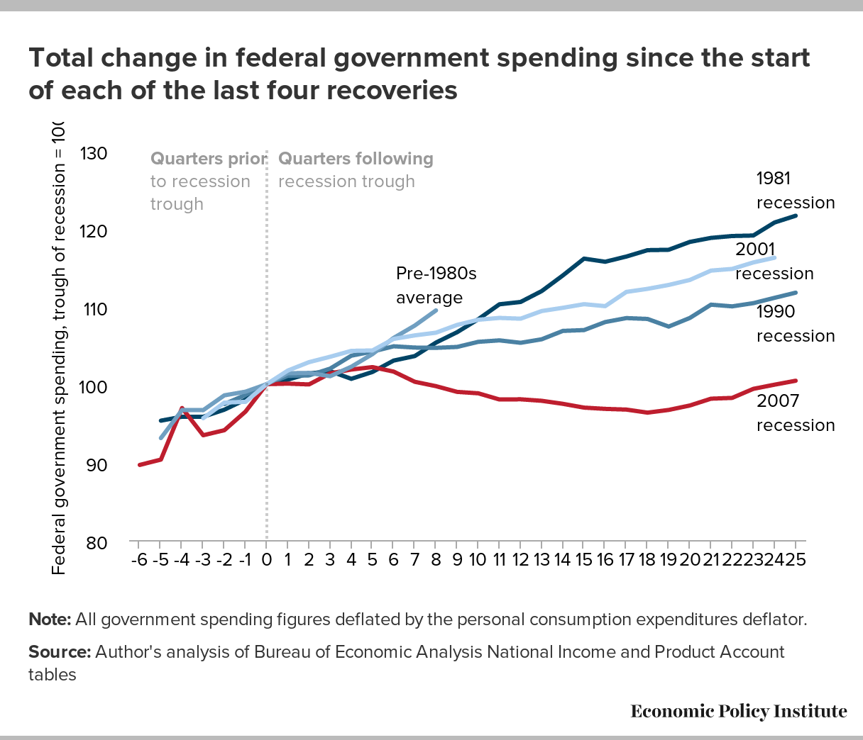
But, say you continue to disbelieve the overwhelming evidence that spending cuts slow growth and worsen recessions. Let’s just look at the data on federal spending in the recovery since the Great Recession versus recovery from the previous three recessions (in the early 1980s, early 1990s, and early 2000s) to see if even the premise of “exploding spending” in recent years is right. The figure below shows (inflation adjusted) federal government spending over the full business cycle (centered on the recession’s trough in the middle of 2009.
Total change in federal government spending since the start of each of the last four recoveries
| Quarters before and after recession trough | Pre-1980s average | 1981 recession | 1990 recession | 2001 recession | 2007 recession |
|---|---|---|---|---|---|
| -6 | 89.64314 | ||||
| -5 | 93.08399 | 95.32006 | 90.32808 | ||
| -4 | 96.68708 | 95.82452 | 96.941 | ||
| -3 | 96.66948 | 95.81996 | 95.63536 | 93.44894 | |
| -2 | 98.56964 | 96.73013 | 97.45154 | 97.63726 | 94.09644 |
| -1 | 99.03784 | 98.02151 | 98.62101 | 97.73444 | 96.48656 |
| 0 | 100 | 100 | 100 | 100 | 100 |
| 1 | 101.4004 | 100.5862 | 101.0683 | 101.7488 | 100.0702 |
| 2 | 101.4475 | 101.3691 | 101.1253 | 102.8239 | 99.96646 |
| 3 | 101.0219 | 101.6677 | 101.9967 | 103.5176 | 101.3901 |
| 4 | 102.2379 | 100.6857 | 103.6547 | 104.274 | 101.8771 |
| 5 | 103.8588 | 101.5682 | 104.1817 | 104.3231 | 102.1916 |
| 6 | 105.9308 | 103.0278 | 104.8606 | 105.8035 | 101.6136 |
| 7 | 107.5184 | 103.6055 | 104.6952 | 106.2585 | 100.3067 |
| 8 | 109.4605 | 105.3312 | 104.6593 | 106.6034 | 99.74576 |
| 9 | 106.666 | 104.7758 | 107.6011 | 99.0135 | |
| 10 | 108.3313 | 105.4306 | 108.2647 | 98.82879 | |
| 11 | 110.2458 | 105.6191 | 108.4987 | 98.03676 | |
| 12 | 110.544 | 105.3082 | 108.3992 | 98.05979 | |
| 13 | 111.9424 | 105.7602 | 109.3831 | 97.86789 | |
| 14 | 113.9511 | 106.8339 | 109.7981 | 97.47885 | |
| 15 | 116.1036 | 106.939 | 110.2605 | 96.99362 | |
| 16 | 115.7025 | 107.9692 | 110.0084 | 96.832 | |
| 17 | 116.3705 | 108.4762 | 111.8337 | 96.74074 | |
| 18 | 117.1865 | 108.3669 | 112.2268 | 96.35075 | |
| 19 | 117.2396 | 107.3885 | 112.7264 | 96.69676 | |
| 20 | 118.2464 | 108.4939 | 113.3679 | 97.26651 | |
| 21 | 118.7623 | 110.1986 | 114.568 | 98.13868 | |
| 22 | 119.0022 | 109.9803 | 114.7831 | 98.2397 | |
| 23 | 119.0674 | 110.3909 | 115.6132 | 99.39947 | |
| 24 | 120.7331 | 111.0707 | 116.2181 | 99.93551 | |
| 25 | 121.6019 | 111.7352 | 100.4405 |
Note: All government spending figures deflated by the personal consumption expenditures deflator.
Source: Author’s analysis of Bureau of Economic Analysis National Income and Product Account tables
Notice anything? Yeah, recovery from the Great Recession has been associated with the most austere spending following a recession in decades. And this weak spending is, by the way, the entire reason why recovery has been so slow to come. Put it really bluntly: if federal spending under the Obama administration had risen at the same rate as it did during these previous recoveries—yes, even the one during the Reagan administration—we’d have between $440-890 billion more in federal spending today, and we’d be at full employment.
2) Boosting job growth and wages means getting the government off our backs: we need to cut taxes and get rid of regulations
Yes, this is smuggling in two bad arguments under one title. But while taxes and regulations are different, the theme of “heavy-handed government is holding back growth” is the same. And it’s pretty easy to demonstrate that neither is a candidate for having smothered incentives or business profitability in recent years.
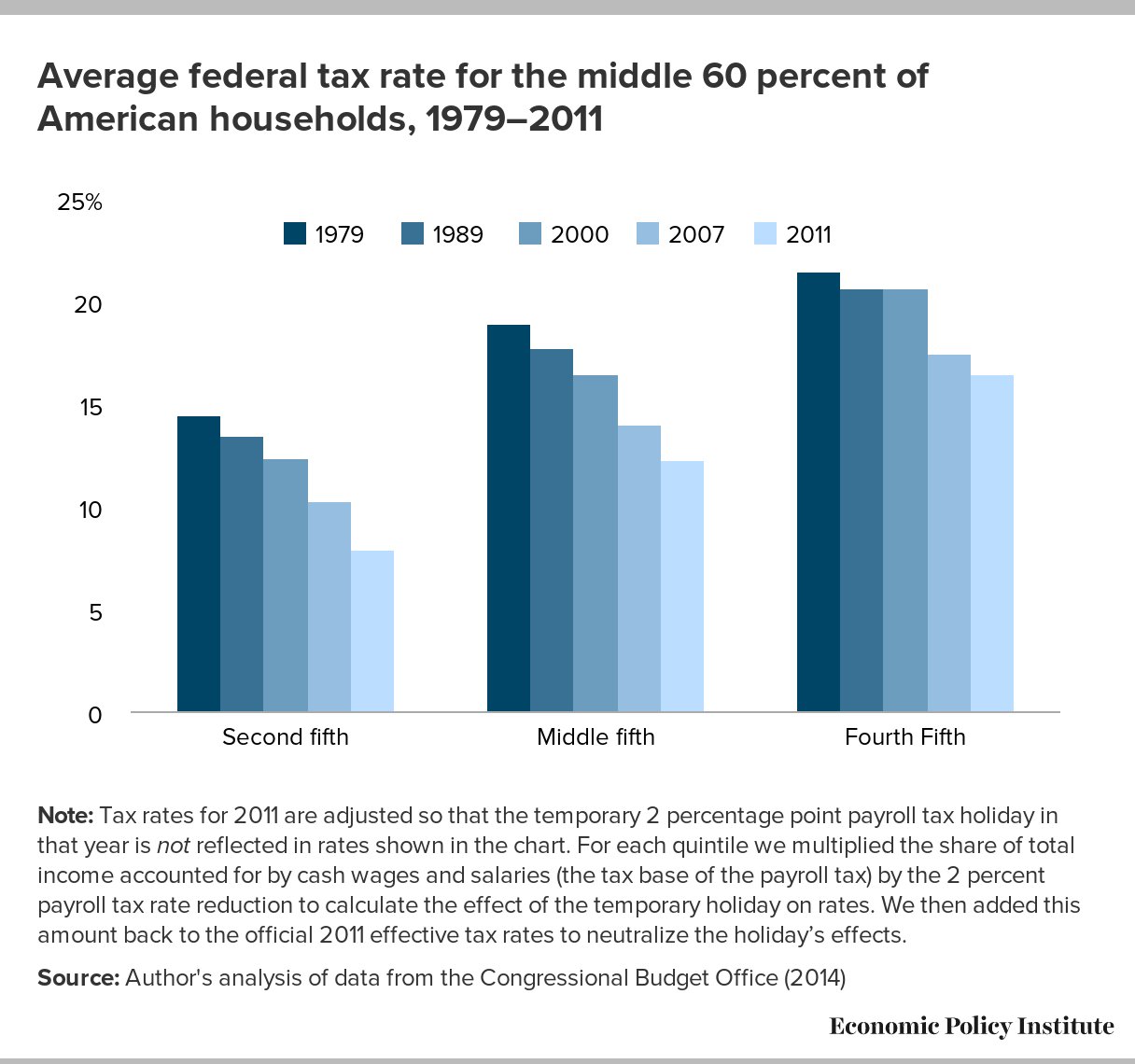
Look below at the figure showing overall federal tax rates for the middle three-fifths (call them the broad middle-class) of American households since 1979. Most of the tax share for these households is actually payroll taxes—the federal income tax share for this group is almost trivially small. There are two things to note in the chart below.
Average federal tax rate for the middle 60 percent of American households, 1979–2011
| Income group | 1979 | 1989 | 2000 | 2007 | 2011 |
|---|---|---|---|---|---|
| Second fifth | 14.5% | 13.5% | 12.4% | 10.3% | 7.9% |
| Middle fifth | 18.9% | 17.7% | 16.5% | 14.0% | 12.3% |
| Fourth Fifth | 21.5% | 20.6% | 20.6% | 17.5% | 16.5% |
Note: Tax rates for 2011 are adjusted so that the temporary 2 percentage point payroll tax holiday in that year is not reflected in rates shown in the chart. For each quintile we multiplied the share of total income accounted for by cash wages and salaries (the tax base of the payroll tax) by the 2 percent payroll tax rate reduction to calculate the effect of the temporary holiday on rates. We then added this amount back to the official 2011 effective tax rates to neutralize the holiday’s effects.
Source: Author’s analysis of data from the Congressional Budget Office (2014)
First, contra Mitt Romney, middle class Americans pay taxes—there is no 47 percent here that pay nothing.
Second, taxes for this broad middle class are down a lot over the last decade (note, taxes for the very rich are down a lot as well), and the decline has been steady. Tax rates for this group in 2013 are lower than in 1979, 1989, or 2007. For the middle-fifth of American households, the overall effective federal tax rate is down by more than 40 percent since 1979. And these tax rates even include the employer side of payroll taxes, so the actual tax rates calculated by most households (who might only include the payroll taxes they directly pay) are quite a bit lower.
Meanwhile, the only economic story for how regulation could be holding back the economy that makes any sense is if a clear increase in the scale of regulatory reach had severely damaged the profitability of business, killing their incentive to produce and hire. It would beautifully hard to make the claim that we’re regulating businesses to death if, say, U.S. corporations were experiencing some of the highest profit rates ever. Hard, but that does seem to be the story that the anti-regulation crowd is sticking to. The figure below shows profit rates for the U.S. corporate sector over time. The regulatory strangling of business in recent years is very hard to see here. But feel free to squint away.
U.S. corporate pre- and post-tax profit margin rate*, 1947–2014
| Year | Pre-tax | Post-tax |
|---|---|---|
| 1947 | 17.5% | 8.7% |
| 1948 | 19.7% | 11.4% |
| 1949 | 18.2% | 11.3% |
| 1950 | 20.4% | 9.7% |
| 1951 | 20.2% | 8.3% |
| 1952 | 18.0% | 8.6% |
| 1953 | 17.0% | 7.7% |
| 1954 | 16.8% | 8.8% |
| 1955 | 19.2% | 10.2% |
| 1956 | 17.4% | 9.1% |
| 1957 | 16.3% | 8.6% |
| 1958 | 14.5% | 7.8% |
| 1959 | 16.8% | 9.1% |
| 1960 | 15.3% | 8.6% |
| 1961 | 15.3% | 8.6% |
| 1962 | 16.4% | 9.9% |
| 1963 | 17.2% | 10.5% |
| 1964 | 17.7% | 11.1% |
| 1965 | 18.7% | 12.0% |
| 1966 | 18.5% | 11.7% |
| 1967 | 16.8% | 10.8% |
| 1968 | 16.3% | 9.8% |
| 1969 | 14.1% | 8.1% |
| 1970 | 11.1% | 6.4% |
| 1971 | 12.2% | 7.4% |
| 1972 | 12.8% | 8.0% |
| 1973 | 12.7% | 7.4% |
| 1974 | 10.6% | 5.4% |
| 1975 | 11.5% | 6.9% |
| 1976 | 13.2% | 7.9% |
| 1977 | 13.5% | 8.2% |
| 1978 | 13.5% | 8.3% |
| 1979 | 12.0% | 7.1% |
| 1980 | 9.9% | 5.6% |
| 1981 | 10.6% | 6.9% |
| 1982 | 9.3% | 6.8% |
| 1983 | 10.5% | 7.5% |
| 1984 | 12.1% | 8.7% |
| 1985 | 11.4% | 8.4% |
| 1986 | 9.3% | 6.2% |
| 1987 | 9.8% | 6.3% |
| 1988 | 10.2% | 6.7% |
| 1989 | 9.1% | 5.7% |
| 1990 | 8.3% | 5.2% |
| 1991 | 8.3% | 5.5% |
| 1992 | 8.5% | 5.7% |
| 1993 | 9.6% | 6.5% |
| 1994 | 11.3% | 7.8% |
| 1995 | 11.8% | 8.3% |
| 1996 | 12.6% | 9.1% |
| 1997 | 12.9% | 9.4% |
| 1998 | 11.5% | 8.2% |
| 1999 | 10.6% | 7.2% |
| 2000 | 8.7% | 5.6% |
| 2001 | 7.0% | 4.9% |
| 2002 | 8.5% | 6.7% |
| 2003 | 10.2% | 7.9% |
| 2004 | 12.2% | 9.1% |
| 2005 | 13.3% | 9.2% |
| 2006 | 14.5% | 10.1% |
| 2007 | 12.7% | 8.6% |
| 2008 | 11.2% | 8.1% |
| 2009 | 10.5% | 7.9% |
| 2010 | 13.6% | 10.5% |
| 2011 | 13.7% | 10.7% |
| 2012 | 14.3% | 11.0% |
| 2013 | 14.9% | 11.5% |
| 2014 | 14.7% | 11.1% |
* The profit margin is defined as unit profits (profit per unit of sales) divided by price per unit in the non-financial corporate sector.
Source: Author’s analysis of Bureau of Economic Analysis National Income and Product Account Table 1.1.15
3) Raising the minimum wage will just make everything cost more and do other associated bad things
It used to be that arguments against raising the minimum wage centered on job loss for precisely the workers that minimum wage increases were supposed to help. One was supposed to be stunned by the sad irony of it, I guess. But researchers have looked hard to see if minimum wage increases really do cause job-loss in the real-world (and not just in introductory economics textbooks). And they don’t.
So now that the job loss argument has been largely defanged, one often hears claims that raising minimum wages will just boost prices, thereby hurting the living standards of precisely the workers that minimum wage increases were supposed to help. Ah, the sad irony again.
There are two responses to this “it will just cause inflation” argument against raising minimum wages.
First, it is actually true that raising the wage of any group of workers will likely put upward pressure on the stuff that these workers produce. So, an increase in the minimum wage could raise prices in, say, the fast food sector. But it’s odd how this same logic doesn’t make people decide that we should push back on policy decisions that raise wages for highly-paid workers. When the people who argue that minimum wage increases will just raise prices see CEO pay exploding because of poor corporate governance and tax policy, do they generally argue that that will raise prices? Or when they see the warnings at the beginning of DVDs against making copies for commercial resale under penalty of criminal prosecution, do they say “hey, that increases prices?”
They should, because these policies do raise prices and hurt the purchasing power of non-CEOs and those who don’t earn income from copyrights. And yet CEOs and owners of entertainment companies still seem to think these are good policies from their point of view. So, low wage workers should absolutely see efforts to raise the minimum wage as useful even if they do put upward pressure on prices.
This reasoning leads to our second point: the wage increase spurred by a higher minimum wage will absolutely dwarf any potential impact on prices for the living standards of affected workers. Take the increase in wage income estimated to be generated by an increase in the federal minimum wage to $10.10 by 2016—roughly $35 billion. Divide this by the total amount spent on consumption goods in the U.S. economy (about $12 trillion) to get a sense of how much this will raise prices in the economy—0.3 percent. To be clear, this does not mean a 0.3 percent increase in inflation, it means a one-time 0.3 percent increase in prices. So, basically a 0.1 percent increase in inflation for 3 years and then dropping back to zero.
Meanwhile, the typical worker affected by the proposed $10.10 increase would see (roughly) a 20 percent raise in hourly pay. And even if the entirety of the minimum wage increase was financed simply by higher prices (it won’t be), then this worker is still much, much better off.
John Schmitt from the Center for Economic and Policy Research has a great paper the sums up lots of this—showing why lots of things (not just prices or jobs) can change in response to a minimum wage increase, including productivity and profit margins.
4) The real problem with today’s economy is workers don’t have the right skills to keep pace with technology
This one is very widespread and very hard to address seriously in just a few sentences. But, some observations.
First, an appeal to authority. People who have looked very carefully at the evidence here find very little to suggest that demand for high-skilled workers has outpaced their supply and that this gap has driven inequality in wage growth in recent years.
Second, even seven years after the start of the Great Recession, there remain two unemployed workers (and more if you count “missing workers”) for each job opening. Today’s excessively high unemployment (and too-low labor force participation) remains mostly a general job availability problem and not a reflection of any “skills mismatch.”
Third, inflation-adjusted wages—even for workers with a four year college degree—have been flat for over a decade. This doesn’t look like an economy rewarding skill per se. Instead it seems to be rewarding a very narrow slice at the top.
Fourth, since the start of the recession at the end of 2007, more than half of all income gains in the corporate sector have gone to capital owners instead of workers (capital owners have generally claimed well under a quarter of total income gains over the past six decades). Unless one is changing the definition of “skilled” to mean “already owning lots of wealth,” it’s hard to see what skills have to do with this.
Finally, many people point to the recent decade’s obvious technological advances as evidence that the economy has been changed in a way that can’t provide decent living standards to many workers. This is far from clear. After all, technology changes all the time. In fact, the way economists measure technological change, the amount of goods and services that can be produced in an hour of work, actually shows more rapid technological change in the 30 years after World War II—a period of much more egalitarian economic growth.
Explanations for economic changes based on technological change always sound convincing, for a simple reason: At any point over the past century you could have walked into a factory and been told about the big technological improvements that had been made over the past decade. If you’re a business writer who walks into a factory today looking for a root cause of the labor market’s doldrums, guess what? You’ll be told about the big technological improvements made over the past few years, and then you might think, “Hey, that’s why the jobs aren’t here and why wages are flat!” But, if you had walked into a factory in 2000—when the unemployment rate reached 3.8 percent—you also would’ve been told about an amazing decade of technological advancements. And you might think “hey, that’s why things are going so well!”
Technology is always advancing, but it does not have to consistently damage most American’s living standards. The reason American workers haven’t been doing well for most of the past three decades is rooted in policy, not technology.
5) Unions haven’t done anything for us
It is often noted that the rise in American inequality and the beginning of the era of what some have called the Great Wage Slowdown is correlated with the declining share of American workers represented by a union.
Yet few people seem to consider this decline in worker representation the outcome of a policydecision. Instead they shrug and decide that unions aren’t modern or aren’t suited for the new economy (however you decide to define that). Yet advanced countries around the world, with economies as productive (or more) than ours, have much higher rates of unionization. The share of workers that wanted to be represented by a union before the Great Recession had reached historic highs, even while the share that were in unions reached historic lows. It’s hard to imagine that policy decisions aren’t playing a role in that growing wedge.
And clearly policy has not kept pace with growing employer hostility to unions or kept the playing field level between employers and workers wanting to join a union—as shown by the increased pace of illegal firings of union organizers in recent decades.
Why should today’s workers care whether or not unions thrive or decline? Tom Edsall raised a good point recently in this regard: those who hate unions sure think policy matters. Every chance they get, advocates for the already-rich fight tooth and nail to not just contain, but roll back workers’ ability to bargain collectively.
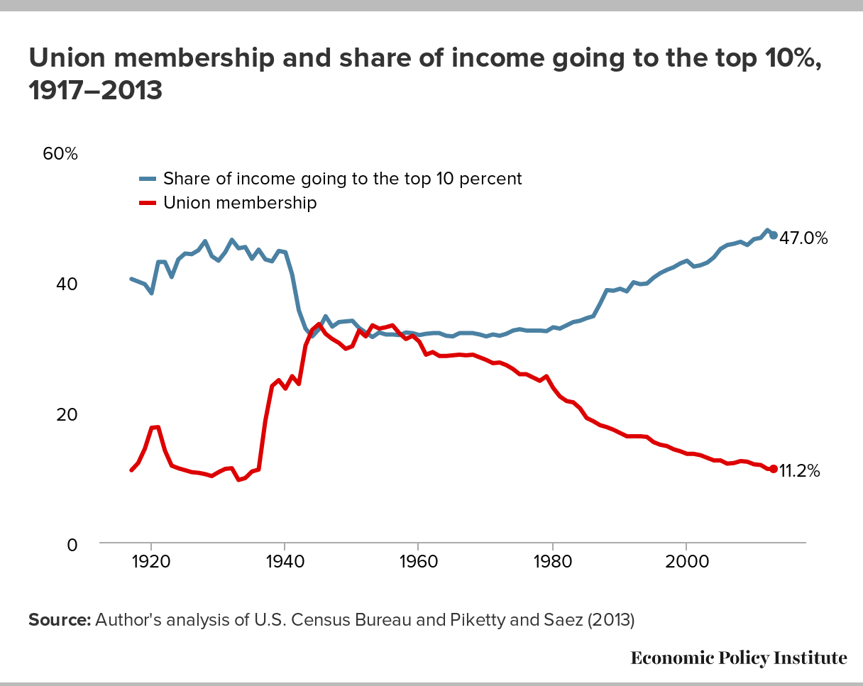
And in purely self-interested terms they’re right. Unions do not damage productivity or employment growth, but they do distribute income gains more equitably between corporate managers/capital owners and workers. And the gains to workers spurred by unionization do not just accrue to union members. When they have power they set standards which spill over into higher wages and better compensation even for non-union workers. Below is an updated chart first made by Colin Gordon showing the long-run relationship between unionization and top income shares.
Union membership and share of income going to the top 10%, 1917–2013
| Year | Union membership | Share of income going to the top 10 percent |
|---|---|---|
| 1917 | 11.0% | 40.3% |
| 1918 | 12.1% | 39.9% |
| 1919 | 14.3% | 39.5% |
| 1920 | 17.5% | 38.1% |
| 1921 | 17.6% | 42.9% |
| 1922 | 14.0% | 42.9% |
| 1923 | 11.7% | 40.6% |
| 1924 | 11.3% | 43.3% |
| 1925 | 11.0% | 44.2% |
| 1926 | 10.7% | 44.1% |
| 1927 | 10.6% | 44.7% |
| 1928 | 10.4% | 46.1% |
| 1929 | 10.1% | 43.8% |
| 1930 | 10.7% | 43.1% |
| 1931 | 11.2% | 44.4% |
| 1932 | 11.3% | 46.3% |
| 1933 | 9.5% | 45.0% |
| 1934 | 9.8% | 45.2% |
| 1935 | 10.8% | 43.4% |
| 1936 | 11.1% | 44.8% |
| 1937 | 18.6% | 43.3% |
| 1938 | 23.9% | 43.0% |
| 1939 | 24.8% | 44.6% |
| 1940 | 23.5% | 44.4% |
| 1941 | 25.4% | 41.0% |
| 1942 | 24.2% | 35.5% |
| 1943 | 30.1% | 32.7% |
| 1944 | 32.5% | 31.5% |
| 1945 | 33.4% | 32.6% |
| 1946 | 31.9% | 34.6% |
| 1947 | 31.1% | 33.0% |
| 1948 | 30.5% | 33.7% |
| 1949 | 29.6% | 33.8% |
| 1950 | 30.0% | 33.9% |
| 1951 | 32.4% | 32.8% |
| 1952 | 31.5% | 32.1% |
| 1953 | 33.2% | 31.4% |
| 1954 | 32.7% | 32.1% |
| 1955 | 32.9% | 31.8% |
| 1956 | 33.2% | 31.8% |
| 1957 | 32.0% | 31.7% |
| 1958 | 31.1% | 32.1% |
| 1959 | 31.6% | 32.0% |
| 1960 | 30.7% | 31.7% |
| 1961 | 28.7% | 31.9% |
| 1962 | 29.1% | 32.0% |
| 1963 | 28.5% | 32.0% |
| 1964 | 28.5% | 31.6% |
| 1965 | 28.6% | 31.5% |
| 1966 | 28.7% | 32.0% |
| 1967 | 28.6% | 32.0% |
| 1968 | 28.7% | 32.0% |
| 1969 | 28.3% | 31.8% |
| 1970 | 27.9% | 31.5% |
| 1971 | 27.4% | 31.8% |
| 1972 | 27.5% | 31.6% |
| 1973 | 27.1% | 31.9% |
| 1974 | 26.5% | 32.4% |
| 1975 | 25.7% | 32.6% |
| 1976 | 25.7% | 32.4% |
| 1977 | 25.2% | 32.4% |
| 1978 | 24.7% | 32.4% |
| 1979 | 25.4% | 32.3% |
| 1980 | 23.6% | 32.9% |
| 1981 | 22.3% | 32.7% |
| 1982 | 21.6% | 33.2% |
| 1983 | 21.4% | 33.7% |
| 1984 | 20.5% | 33.9% |
| 1985 | 19.0% | 34.3% |
| 1986 | 18.5% | 34.6% |
| 1987 | 17.9% | 36.5% |
| 1988 | 17.6% | 38.6% |
| 1989 | 17.2% | 38.5% |
| 1990 | 16.7% | 38.8% |
| 1991 | 16.2% | 38.4% |
| 1992 | 16.2% | 39.8% |
| 1993 | 16.2% | 39.5% |
| 1994 | 16.1% | 39.6% |
| 1995 | 15.3% | 40.5% |
| 1996 | 14.9% | 41.2% |
| 1997 | 14.7% | 41.7% |
| 1998 | 14.2% | 42.1% |
| 1999 | 13.9% | 42.7% |
| 2000 | 13.5% | 43.1% |
| 2001 | 13.5% | 42.2% |
| 2002 | 13.3% | 42.4% |
| 2003 | 12.9% | 42.8% |
| 2004 | 12.5% | 43.6% |
| 2005 | 12.5% | 44.9% |
| 2006 | 12.0% | 45.5% |
| 2007 | 12.1% | 45.7% |
| 2008 | 12.4% | 46.0% |
| 2009 | 12.3% | 45.5% |
| 2010 | 11.9% | 46.4% |
| 2011 | 11.8% | 46.6% |
| 2012 | 11.2% | 47.8% |
| 2013 | 11.2% | 47.0% |
Source: Author’s analysis of U.S. Census Bureau and Piketty and Saez (2013)
So it makes perfect sense for those invested in the economic wellbeing of highly-paid corporate managers and capital owners to hate unions. What makes much less sense is that too many of the rest of us don’t seem to appreciate what they do.
6) By keeping interest rates low, the Federal Reserve hurts “poor savers”
I should start by noting that the whole idea of “poor savers” is odd. Genuinely asset-poor households tend to be net borrowers, not net savers. Net borrowers are hurt—and hurt a lot—when inflation comes in below expectations. Think about a mortgage which comes with a fixed monthly payment of $1,500 per month. When you take out a mortgage, a key variable for how affordable it will be over the life of the loan is what you forecast for the rate of inflation over that time. Say that you made the common-sense assumption that the Fed will meet its 2 percent inflation target in coming years. This means you counted on your monthly payment getting cheaper (by 2 percent) in price-adjusted terms every year over the life of your mortgage. If inflation instead comes in well below this target (the way it has in recent years), then the inflation-adjusted burden of your mortgage erodes much more slowly, and your mortgage has become less affordable.
So, how can the Fed insure that they actually meet their inflation target and help net borrowers? Keep rates low.
Moreover, for those who really do have significant net savings (we should probably tend to refer to them as “wealthy,” by the way), it is true that rates of return on their savings (mostly held as government bonds or private sector stocks and bonds) have been low in recent years. But the arithmetic and the economics of assets and rates of return is clear that low rates of return on assets are essentially always and everywhere associated with high prices for these assets. Take a bond that will pay off $110 in one year. If the price one must pay to obtain this bond today is $100, then the rate of return is 10 percent. If the price one must pay to obtain this bond today rises to $105, then the rate of return falls to (just under) 5 percent.
Yes, it gets more complicated than this pretty quickly, but the fundamental insight remains that rates of return are low today because assets are so expensive. Given this, it is very had to take complaints from significant net savers seriously, when they are essentially complaining that their assets are so valuable (and they themselves are so wealthy today) that rates of return going forward won’t be particularly high.
So, what about “poor savers” who have all their net worth in a cash account (i.e., not stocks or bonds)? Aren’t they hurt by low rates? Conceivably—but nobody with significant assets (say more than $5,000) holds them all in cash. And for $5,000 in cash, the difference between 3 percent returns and zero is about $150. Not nothing, but compare these losses relative to the broader damage done by higher rates and it’s still an awfully weak argument.
Finally, and most importantly, the most important transmission mechanism from Fed interest rate policy to income distribution comes though the labor market. Because low interest rates boost economic growth and lower unemployment, they boost wages for workers—and these wage boosts are most pronounced for low- and moderate-wage workers. These labor market effects swamp the effects on asset prices for the vast majority of Americans, because income for most American households is dominated by their weekly paychecks, rather than what they earn from asset holdings.